Source- http://www.baconsrebellion.com/Issues03/09-22/Scatteration.htm
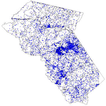
Here we have a dot distribution map that displays the use of dots to be represent for a single variable. The more dots there are in a given region the frequent the variable is being represented. This above is the representation of population density of Fauquier county. It seems most people live within the middle of the county. Each of the dots is expressed as 10 people.
No comments:
Post a Comment