
Source - http://www.math.yorku.ca/SCS/sugi/sugi16-paper.html
Star plots are graphical representation of portraying different variables for each ray of the star that is shown. Star plots are useful when the scales all have the same direction so you no when they are increasing or decreasing. For example the star plot above is a plot for automobile data, each of the stars represent a different kind of car and characterize by the lightest being at the top and the heaviest being at the bottom. Variables at the side are related to the size of the vehicle and others are for the price and performance.
 Source - http://my.ilstu.edu/~jrcarter/Geo204/Choro/
Classed choropleth map is a map that depicts area boundaries and different data for each of the states involved with the sample. It is up to the cartographer that makes the map to decided which key he is going to used for these kinds of maps. The pattern of this map is that there are more males living within the west part of the USA, not so much from the south.
 Source- number 8 on page. http://personal.frostburg.edu/mtmaier0/maps.htm
Range graded proportional circle map are maps that have a single variable that is being depicted by circle some big some small. But each circle has a number that goes along with it and a area that has the circle within it. On this map it measures the Traffic fatalities in the US by state in 2009. The pattern that is here is that people in the northeast are more likely to die from a traffic accident than people in the northwest.
 Source - http://personalpages.manchester.ac.uk/staff/m.dodge/cybergeography/atlas/census.html
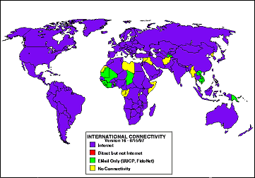
This right here is a statistical map which means that it is map that has some sort of measurement that the data can be plotted on to the map. Statistical maps can be used for all sorts of things like population density, temperature and international connectivity like the one above is showing. The pattern that this map shows is that pretty much all of the world uses internet while some uses other sources of connectivity.
 Source - http://www.jbaas.com/HTML/Previous%20Issues/Volume%20No.%202%20No.%202/Headings/H-7.html
Similarity matrix is matrix that expresses scores in a similarity terms for a set of two data pieces. This helps us look at data with multivariable but without having to look at more than one graph so in essence is put it into simplify term.
 Source - http://eps.mq.edu.au/courses/GEOS219/choropleth.htm
Unstandardized choropleth maps are maps that use a color sequence to depict a variable that was measure for a given region. ABove we have a unstandardized choropleth map of the world and the variable being measured is the total fertility rate for 2000-2005. Each color is represented by a different range of numbers and the pattern for this map shows that Africa has the highest total Fertility rate for the given years.
 Source - http://andrewgelman.com/2007/10/parallel_coordi/
Parallel coordinate graph is a graph that uses high volume lines or a 3D perception that compare many different variables at one specific time. The backdrop of this graph are parallel lines. Every line has a different value and set of data that is represented.