Tuesday, November 27, 2012

Star Plot


Fig3


Source - http://www.math.yorku.ca/SCS/sugi/sugi16-paper.html 

Star plots are graphical representation of portraying different variables for each ray of the star that is shown. Star plots are useful when the scales all have the same direction so you no when they are increasing or decreasing. For example the star plot above is a plot for automobile data, each of the stars represent a different kind of car and characterize by the lightest being at the top and the heaviest being at the bottom. Variables at the side are related to the size of the vehicle and others are for the price and performance. 

Classed choropleth map


Source - http://my.ilstu.edu/~jrcarter/Geo204/Choro/

Classed choropleth map is a map that depicts area boundaries and different data for each of the states involved with the sample. It is up to the cartographer that makes the map to decided which key he is going to used for these kinds of maps. The pattern of this map is that there are more males living within the west part of the USA, not so much from the south. 

Range graded proportional circle map


Source- number 8 on page. http://personal.frostburg.edu/mtmaier0/maps.htm

Range graded proportional circle map are maps that have a single variable that is being depicted by circle some big some small. But each circle has a number that goes along with it and a area that has the circle within it. On this map it measures the Traffic fatalities in the US by state in 2009. The pattern that is here is that people in the northeast are more likely to die from a traffic accident than people in the northwest. 

Statistical Map

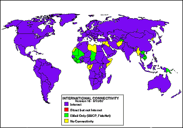
Landweber map - click for larger image

Source - http://personalpages.manchester.ac.uk/staff/m.dodge/cybergeography/atlas/census.html

This right here is a statistical map which means that it is map that has some sort of measurement that the data can be plotted on to the map. Statistical maps can be used for all sorts of things like population density, temperature and international connectivity like the one above is showing. The pattern that this map shows is that pretty much all of the world uses internet while some uses other sources of connectivity. 

Similarity Matrix


Source - http://www.jbaas.com/HTML/Previous%20Issues/Volume%20No.%202%20No.%202/Headings/H-7.html

Similarity matrix is matrix that expresses scores in a similarity terms for a set of two data pieces. This helps us look at data with multivariable but without having to look at more than one graph so in essence is put it into simplify term. 

Unstandardized Choropleth maps


Source - http://eps.mq.edu.au/courses/GEOS219/choropleth.htm

Unstandardized choropleth maps are maps that use a color sequence to depict a variable that was measure for a given region. ABove we have a unstandardized choropleth map of the world and the variable being measured is the total fertility rate for 2000-2005. Each color is represented by a different range of numbers and the pattern for this map shows that Africa has the highest total Fertility rate for the given years. 

Parallel Coordinate Graph

mdg1.png

Source - http://andrewgelman.com/2007/10/parallel_coordi/

Parallel coordinate graph is a graph that uses high volume lines or a 3D perception that compare many different variables at one specific time. The backdrop of this graph are parallel lines. Every line has a different value and set of data that is represented. 

Bilateral Graph

Figure: Graph showing complications by age group for patients undergoing bilateral total hip arthroplasty and bilateral total knee arthroplasty

Source - http://www.healio.com/orthopedics/hip/journals/ORTHO/%7B0B0108A2-3A34-4788-825B-E6533F73C62F%7D/One-stage-Bilateral-Total-Joint-Arthroplasty-A-Prospective-Comparative-Study-of-Total-Hip-and-Total-Knee-Replacement

Bilateral Graph is a graph that compares more than one variable at a time for a given data set. Bilateral graphs can be also used for line graphs but the one above is bar graph that compares males and females and the difference in age that have been a patient. This particular bilateral graph is a small sample with the largest number being 28 and lowest being 3. 

Nominal Area Choropleth Map

Map of States for Bush, States for Kerry, and undecideds

Source - http://www.veiled-chameleon.com/weblog/archives/2004_07.html

Here we have a Nominal Area Choropleth map that depicts the 2004 election with showing swing, republican, and democrat states in there respected. Nominal area choropleth maps compare variables over a given area to map it easier to compare the them. The pattern above is that most states are republican rather than democrat but also that most states are in fact a swing which they can go either democrat or republican. 

Lorenz curve

Lorenz curve

Source- http://www.sarpn.org/documents/d0000990/

Lorenz curve which plots the perfect equality of wealth distribution as well as the reality line which is the lorenz curve. The difference between the lines is measured by the amount of discrepancy between what we view as perfect and what is actually perfect. The pattern above is that less household get more of an income when compared to the line of perfect equality. 

Isopleth

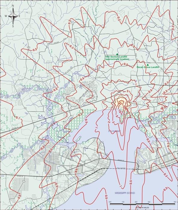
Scrabble Bingo of the Day: ISOPLETH


Source - http://scrabble.wonderhowto.com/inspiration/scrabble-bingo-day-isopleth-0129881/

Isopleth are lines on maps the connect places that are seem to be with holding the same amount of geographical phenomenon. An isopleth is an isogram which means that the variable cannot be measured over a single point but rather calculated for an overall area. Isopleth are most used when expressing population density.  This picture above is depicting the annual average dioxin concentrate from 1992 in Dupont a plant in Mississippi. The pattern seem the most concentrate is coming from the inner core of the isopleth rather than the outside. 

Isopach


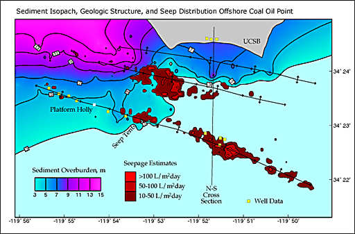
Source - http://seeps.geol.ucsb.edu/pages/isopach.html

Isopach are maps that use thickness to measure a given variable over a period of time. The map above is a map of offshore coal and oil points that have an over abundance of sediment on the ocean floor, the pink area means the thickest while blue means thin. The pattern of this map is the the thickest part of the ocean floor is in the top left or the northwest corner. 

Isohyets

isohyets-noaa-fri-sat-sun12z.gif

Source - http://www.bbc.co.uk/blogs/weather/ianfergusson/2010/06/formula-one-weather-forecast-c-1.shtml

Isohyets are simply the lines that are joining points of equal rainfall or precipitation on a map in a given period. In the map above it shows the isohyets throughout the United States. The pattern that is shown in this map is that rainfall or precipitation happens mostly in the inland of the country. 

Isotach

Graphic at 300 or 200 mb Showing Example Height Field, Isotachs, and the Jet Stream

Source - http://www.crh.noaa.gov/lmk/?n=basic-fronts

Isotach are contour lines that connect points that have an equal wind speed.  Isotach also uses colors to represent the rain fall in the given area. The isotach above is depicting the isotach through the southern part of the United States. The pattern is that the wind is blowing fast from east to west.

Cartographic Animation

Air Temperature


Source - http://uwacadweb.uwyo.edu/JSHINKER/animations/global/

Cartographic animation is animation of map that has movement or show a change in something. These kinds of map are need to be used by computers or video so the change can be seen. Most of the maps I've looked at are the change in temperature which the one above is. Its a never ending cycle for these maps because they keep the movement alive. Cartographic animation is more of a high tech map that cane be seen on the weather channels when a storm is approaching. The map above is definitely a temperature map because of the colors and the way the movements are. The blue goes up for summer then comes back down for winter (if you are looking from top-down).

Infrared Aerial Photo

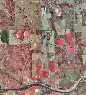
Infrared aerial photo of the LBJ Ranch

Source - http://www.nps.gov/lyjo/naturescience/naturalfeaturesandecosystems.htm

Infrared Aerial Photo is tool that is used to depict the changes in the environment. As seen above there are many different color that go into a infrared aerial photo. Lets start with the reddish colors, those seem to be paired with healthy or growing vegetation, the deeper and darker the color is the more dense it is. Next,  there are like grayish green tones which are described as the dead or dying features. Above most all the area has red but you sure do see the green or tan to indicate that some of the crop or forest around there are not getting proper nutritions. 

Cadastral Map


Source - http://www.fig.net/cadastraltemplate/fielddata/d2.htm

Cadastral maps are used to show land and the boundaries that each piece of land is around. I believe the best way to explain a map like this is by say its just like a map of house properties with each one having there own ownership of land. It divided up the land into boxes with number within them to show the individualistic of each one like shown above. Some might provide additional info like street names or bodies of water but the map above is great example. 

Continuously Variable Proportional Circle Map

graduated and mimetic symbols\

Source - https://www.e-education.psu.edu/geog486/book/export/html/1796


Continuously variable proportional circle map is a map that uses circle to depict data over a given area. There are different size circle which indicates different vaules. The circles that are are the smallest are given the smallest number and circles that a biggest are given the bigger numbers. if you look at the map above, it depicts California and the number of motor vehicle deaths in a given year. The biggest circle is represented with the number 26,099 so anywhere there is a big circle that is how many deaths took place there and so on and so on. The pattern that seems to be here is that near the middle of the state there are move vehicle deaths the the north of the state but towards the end of state it has a few places that have a larger total number of deaths. 

DOQQ


Source - http://www.geology.enr.state.nc.us/doqq.html

DOQQ or Digital Orthographic Quater-Quad is a digitized image that has been taken from the air. DOQQ is used to measure the true distance between places and things. It is the actual picture of a piece of land. Also this kind of map is corrected with the use of pixels that will help with the latitude and longitude lines. The map above is a DOQQ of a place in North Carolina, which if you look at it kind of looks like a google maps or earth image. 

Correlation Matrix

ImageDescriptive statistics and correlation matrix for study variables – correlation matrix
Source - http://www.emeraldinsight.com/journals.htm/journals.htm?articleid=1515237&show=html&WT.mc_id=alsoread

Correlation matrix are relationships between two different variable. Lists of individual correlations between the variables is how you can determine the actual variance. This matrix above is a simple one and has a pattern that can be seen throughout the entire one. 

Windrose

<b>Distribution - 1</b><br>Distribution Wind Rose plot for Air Temperature.

The Distribution Wind Rose allows you to view the distribution of a second Variable in connection to Wind Direction.

Source- http://www.vistadatavision.com/wind-rose/

Windrose is used in meteorology to determine how much speed the wind has and which direction it is coming from. A wind rose is a circular format with a north, east, south and west direction. Each length of the colorful line represents the frequency that the wind will blow in that direction. In this windorse above it seems the pattern is that the wind will most likely be blowing in the direction of northeast to southeast.

Standardized Choropleth Map


Source - http://www.directionsmag.com/articles/choropleth-mapping-with-exploratory-data-analysis/123579

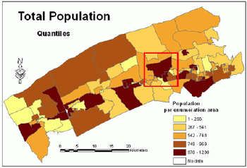
Standardized choropleth maps are devised to express the distribution of particular information over a specific area.  In this map above it depicts a given are of their total number of people living within it. Seems that most of the population lives in about an evenly distributed of the entire county. 

Univariate Choropleth Map


Source - http://www.colocarto.com/custom-thematic-maps.html

Here we have a univariate choropleth map that measure only a single variable on a map, unlike a bivariate that measures two variables at a time. This map measure the estimated median household income for 2008 of the United States. These kinds of map are easy to read becuase of the simplistic amount of information on them. As you can see there is a key to tell you what color match what income rate. The pattern of the map is that the west seems to have a better estimated median income than the east does for 2008. 

DLG

Digital Line Graph of Beaufort, SC

Source - http://www.dnr.sc.gov/GIS/descdlg.html

DLG or also known as digital line graphs use the U.S. geological survey which provide all the boundaries, transportation, hydrography and hypsography. DLG also use different scales large , intermediate and small. This map above is a prime example of a DL, it is a region in South Carolina called Beaufort. It uses lines and boundaries to indicate where roads and body of water are through out the region.

DEM


Source- http://en.wikipedia.org/wiki/Digital_elevation_model

DEM or digital elevation models are used most often for remote sensing. This kind of models show topographic information especially elevation. It gives us a great understanding of how land around changes through hills, mountains..etc. This map above is a relief map of Sierra Nevada. As you can tell from this map DEM sometimes use different colors to indicate where the highest peaks are and the lowest come from. Green to yellow is usually the lowest, while orange, red and even some white are the highest receptively.  The patterns of this particular map is there seems to be a mountainous where the orange-red is, some major peaks in the middle of it. 

Monday, November 26, 2012

DRG

Digital Raster Graphic for Bushkill PA

Source - https://www.e-education.psu.edu/natureofgeoinfo/c6_p6.html

Digital raster graphic or DRG, is a digital image that has been scanned paper of a map to be used on the computer. This map was created from USGS topographic map series, DRGs would transform to the UTM or universal Transverse Mercator projection to match the control points.

Dot Distribution Map


Source- http://www.baconsrebellion.com/Issues03/09-22/Scatteration.htm

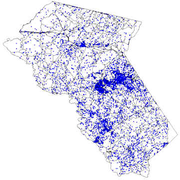
Here we have a dot distribution map that displays the use of dots to be represent for a single variable. The more dots there are in a given region the frequent the variable is being represented. This above is the representation of population density of Fauquier county.  It seems most people live within the middle of the county. Each of the dots is expressed as 10 people.

Isoline Map


Source - http://www.personal.psu.edu/faculty/c/a/cab38/GEOG321/14_multivariate02/15_isoline.jpg
http://www.personal.psu.edu/faculty/c/a/cab38/GEOG321/14_multivariate02/multivariate.html

Isoline are used to represent points of equal values, the meaning of iso is equal. In this map above it uses lines to to tell the equal average of temperature isotherms. The lines are around 65, 60, 55. around the Caribbean and Florida. The pattern is that its gets cold the more you move up north.

Flow Map


Source- http://www.personal.psu.edu/faculty/c/a/cab38/GEOG321/14_multivariate02/22_arrows.jpg
http://www.personal.psu.edu/faculty/c/a/cab38/GEOG321/14_multivariate02/multivariate.html

Flow maps are used expresses movement through lines. This flow map above shows the movement of people from Ireland, England and Scotland going to Europe. The lines have little arrows within them to show which way the population is moving. Around 316,000 people moved to Europe and only 12,100 people were going to Ireland, England, and Scotland.

Bivariate Choropleth Map

Two-variable choropleth Census 2000 map detail

Source - http://www.personal.psu.edu/faculty/c/a/cab38/GEOG321/14_multivariate02/multivariate.html

This is bivariate choropleth map that compares two (bi) variables (variate) on a single map. On this map it explains the percent change in pop. through 1990-2000 and compares it to the people per square mile. This map patterns are that people where moving south away from the north as you can see in West Virginia by it being the lightest of the colors as in Georgia and florida being the darkest of the colors. 

Index Value Plot

time-series plot for all time

Source - http://waterwatch.usgs.gov/index.php?r=ct&m=real&w=real%252Cplot

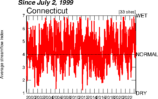
Index Value Plot is a plot that compares the difference in a two variables over a period of time. In this particular index value plot it uses Connecticut to compare the average streamflow and how wet normal or dry in was. All this really is a connection of dots throughout the time 1999 through 2012. There is not much a pattern in this just that every year has sometime dry and wet streamflow. 

Population Profile


Source - http://www.ninis.nisra.gov.uk/mapxtreme/InteractiveMaps_Demography.asp

Here we have a population profile, this is of Ireland in 1971. Population profile are suppose to shows population in the number of age. In this profile it expresses the ages from 0 - 100 of males and females. Some profiles like this one shows a key about which age is the median which was 28, the total number of the both males (10234) and female (10326) , as well as the ratio of females to males that is 1.01. As you seen in this profile it says the years (1971-2043)in which it took it sample from but in fact this is only the 1971 profile because at the bottom of the profile it has a back to forward slide bar and it is on all the back to represent 1971. 

Triangular Plot

Triangular plot of current election situation

source - http://www.ex-parrot.com/%7Echris/wwwitter/20050407-it_doesnt_matter_how_you_vote_either_way_your_planet_is_doomed.html

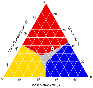
Triangular Plots are those plots that have three variables that can be produced into one constant. It usually that you have an a, b, c and thay all have to add up to 100 to be considered to plot like this. The plot above is a estimated ratio of populations who intends to vote for the major parties. The pattern is that votes are most likely to vote for liberal democrat than labour vote.  This plot is very much used when plotting things that have so much relationships with each other it can be compared at all the same times. 

Hyposmetric Map


 Source - http://wn.com/contiguous_united_states

This right here is a Hyposmetric Map of the United States of America.These kinds of map gives the viewer an good idea of the elevations throughout the world. As you can see most of the these maps like this one has a scale it uses to determine how much elevation is taking place. The colors range on each map is different but on this one its from green to white, green being the lowest and white meaning highest peaks. From this map its easy to tell the the east coast of the USA is mostly flat but on the other hand the west seems to be very rocking on reason being the Rocky Mountains the runs through there and some of Canada. 

Monday, November 19, 2012

Cartograms


Cartograms distortions to depict information in a very unique way. The size and shapes of the map are usually the things that get distorted. In the map above it uses the USA population to distort because the bigger one area is the more people live there. Florida, California, and New york are one of the few larger states for the reason that they have the most population compared to other states.. 

Histogram

histogram of heights of people

Source - http://www.analyzemath.com/statistics/histogram.html

A histogram is representations of how frequent something that is being measured has happened. Histograms can measure a number of different things. Each bar is a representations of how many people fall into the category of what their height is. Histograms differ from bar graphs because of the how close the bars a located to each other.  This picture above is the height of 30 people and how frequent people have the same height. 

Scatterplots

[IMAGE]

Source - http://v8doc.sas.com/sashtml/gref/z7view.htm

Scatterplots are often used in mathematics to portray collected points that have value. It comparing two different categories at one time, for example above it compares weight of a person which is on the x axis to their height on the y axis. The way you plot the information on the graph is by first going across the bottom to find where your first value (weight) falls then go up to find where the second value height in this case. Scatterplots are great to use when you are trying to determine where the outliers are because they are easy to locate rather then going through a set of data. 

PLSS

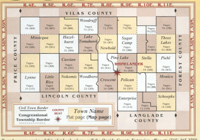
Oneida County Map showing Surveyors Townships

Source - http://wigenweb.org/oneida/tmap.html

Public Land Survey System known for the acronyms PLSS are a way to divide, subdivide and describe land within the USA. Its divides land that is owned by the Federal government. It separates land into townships which are typically 6 square miles. Townships are subdivided into 36 one square sections. The land is surveyed through the north, south, east and west from the initial point. The picture above is a common way to depict a few counties with several townships for each county. 

Thematic Map

Example of Thematic Map


Source - http://lib.westfield.ma.edu/censusaff.htm

Thematic maps have been used for a number of different things like population, elections and many more. Each color of this map type is set to a specific category. The map above is a Thematic map it describes the median age in the Northeast. Each color of this map is a different age group, so all you do is find the age group you are looking for, then get the color that represents the age and discover where on the map that the most people are within that group. Each thematic map should have legend or key so that you can know everything you need to know about the map.

Black and white photography

Manhattan skyline with New York City skyscrapers aerial view in black and white Stock Photo - 9479863

Source - http://www.123rf.com/photo_9479863_manhattan-skyline-with-new-york-city-skyscrapers-aerial-view-in-black-and-white.html

Black and white aerial photography are known as negative infrared films that are a picture that has been transformed into a black and white and are used as a map. These kinds of photos are taken from a helicopter, plane or balloon to make the photo come from the air. This picture above shows a black and white photo of the Manhattan skyline. As you can see this everything is in black and white and no colors are anywhere to be found. 

Box plot

code/website-traffic-example.R
source - http://connectmv.com/tutorials/r-tutorial/basic-plots-in-r/

This is an example of an box plot. A box plot is way to group together a set of data in a convenient way. It graphs the data set of different categories so that you can compare them to one another.There are five numbers that are summarized through one of these boxes. WHich are minimum, first quartile, median, third quartile, and maximum. The top line of the box is the third quartile and the bottom line is the first quartile and the space between the two is called the interquartile range. The line within the rectangular box is known as the median of the data.  The whiskers that are attacked to the box are maximum which is above and minimum is below. 

Lidar

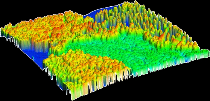
Blue Ridge, Washington, USA

Source - http://www.lidarbasemaps.org/

Lidar also known as LIght Detection And Ranging, Its a system of light from a laser that detects or measures distance. The way to get a lidar is to have something airborne, like a helicopter, to scan the with a laser.
As you see in this picture above it shows an array of color mostly green, yellow and red, each color represents different levels of distances low, medium and high respectively. The lidar doesn't use any kind of radio waves so hence it's not a radar. 

Stem and Leaf

???


Source - http://www.mrnussbaum.com/mathdrills/graphing/stemandleaf.htm

Here is a stem and leaf plot. This graph is use for a multiple reasons, one being it condenses the info to just a few numbers. It is a great tool to use when trying to find the median or mode of a given data set. This stem and leaf plot above is grades that came from a science test.  The stem column or the left hand side gives the tens digit while the right column the leaf gives the ones digit and you put them both together and you get a score. Look at the digit 6 in the stem side its paired with a 8, 4, 3 so the scores would be 68, 64, 63 respectively.

Mental Maps


Source - http://andrewshears.com/2010/12/19/mapping-geo-autobiography-my-mental-map-of-the-world/

Mental maps are drawn by ones self as you recall a place you've once visited or seen. It is the perception of how a person views that region. This map right here shows how Andrew Shears believes how the earth looks with all the continents.  This would be an excellent example because not all the maps are going to look like this, every mental map is very unique

Sunday, November 18, 2012

Propaganda Map


Source - http://www.reporter.am/go/article/2010-08-17-british-library-exhibit-features-magnificent-maps

Propaganda maps are maps that try to portray a certain topic or goal of one nations government. It usually goes along with views of parties that want to give a representation of there ideology in the form of pictures on a map. It tends to appeal to emotions so there people would think one way or another. Propaganda maps use size to convey messages of status and power 
This map is represented by a giant octopus as Russia trying to in Turkey and his tentacles threaten Persia, Central Asia. Greece is drawn as a crab because it would be ready to join the Russians on the attack of Turkey. Germany is an emperor trying to push the octopus back. This is a propaganda for the war and the countries that would be impacted. 

Unclassed Choropleth


Source -
http://www.math.yorku.ca/SCS/Gallery/milestone/thumb5/popup/bssn1_popup1-19.htm

A unclassed choropleth map has the use of shading of places. This map is of 1826 France and it depicts the literacy rates, the darker the section of the country has the most literacy rates and places with lighter shades or no shades at all have the least literacy people living in it. This map doesn't use a key to represent anything. As seen in this map most people in 1826 were not able to read or write which makes a lot of sense because it not many people back then took the time to learn it. Also the area that has the darkest spot is Paris where most of the higher class lived at that time. 

Isobars


Source - http://www.crh.noaa.gov/unr/?n=05-06-99

Isobars are used by metoroglyist to determine the areas of equal air or atmospheric pressures. This map is the area of the northwest around North and South Dakota, Wisconsin. It depicts that the area has low air pressure, the lines will never touch as well. Isobars are used on televisions for news weather reporting.   

Doppler Radar


Reflectivity data for Hurricane Charley on Friday, August 13, 2004.


Source - http://www.hurricanescience.org/science/observation/landbased/radar/


Doppler radars are one of the maps that use on almost a daily basis to view when either rain is coming or how big a a storm is going to be. It uses the Doppler effect which is the change in frequency of an object that is moving. This exact map if from Hurricane Charley that made landfall around the Fort Myers area. If you look at the map the eye is very distinct, its the little circular object above the y in myers. According to Doppler radars there are different color types that are used. Green, yellow, red and purple with variations of them. Green illustrates light, yellow is for moderate while red is heavy and purple is extreme.

This Hurricane was seem to be one of the first ones to hit the west coast of florida in a long time. I was actually at my home in South Florida at the time this hurricane hit and it was very devastating to everyone in the area that lost lots, i do not believe this hurricane was as heart breaking as Hurricane Katrina and Sandy. I believe everyone that looks up the weather on the computer use the Doppler radar.

Climograph


This is a climograph for London, England which shows the representations of the amount of precipitation and temperature. This type of graph makes it easier for us to quickly view when the temperature is cold or hot and when it will be raining. For example the map shown here indicates that during the months of May through September seem to be the hottest and months January, August, October and November are when the most rain is falling. Notice that the temperature in celsius and the precipitations is in millimeters. 

To read this kind of map first you find the month you want to view then look up locate where the bar graph ends and go to the left to figure out how much precipitation there was. next go back to the same month find where the line graph falls follow it to the right to see what the average temperature.

Wednesday, September 5, 2012

Topographic Map


Source- http://www.geomart.com/images/raisedrelief/co.jpg

This is a topographic map of the State of Colorado. Topographic maps are very unique they show the rise in terrain and elevations of specific places. It is a large-scale map that shows both man made and natural landmarks. For example, here is a map of Colorado, the Rocky Mountains are extremely elevated compared to the rest of the land because they are about 14,000 feet above sea level. Each of these maps would usually have some sort of scale at the bottom to depict the terrain and how much it is above sea level.

So we use topographic maps when we are traveling though the state such as backpacking up mountains. If these kinds of maps didn't exist nobody would have any idea of how much different elevations each side of the state really is.